
Be sure to cast your votes in the poll below; but first, let’s check out the box art designs themselves.
North America / Europe #1
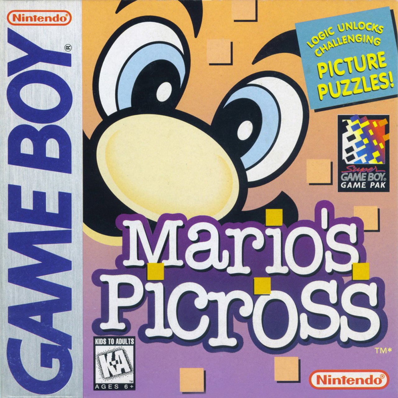
The design shared by North America and select parts of Europe (including the UK) is a pretty trippy one. Mario’s disembodied facial features float against a purple/orange background, while brightly-coloured squares trickle down the image. We particularly like how one of these squares sits atop the ‘i’ in ‘Mario’ as if it’s a dot – now there’s some attention to detail.
Europe #2
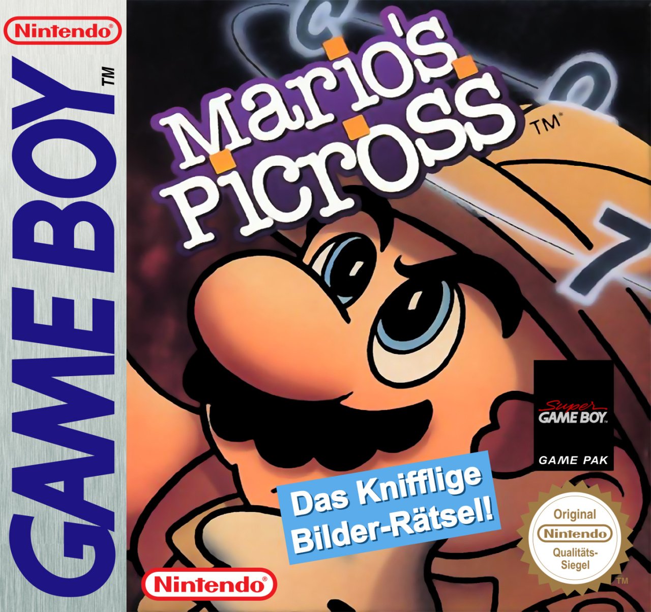
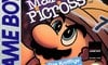
The European design that you would have found in the Netherlands, France and Germany takes a very different approach. This one has an inquisitive Mario in the same explorer’s outfit that he dons in the top corner of the screen for each Picross puzzle. The numbers circling his head certainly hint at some of the puzzling that the game will demand of you, but maybe it sets things up to be a little more adventure-based? Hey, whatever sells.
Japan
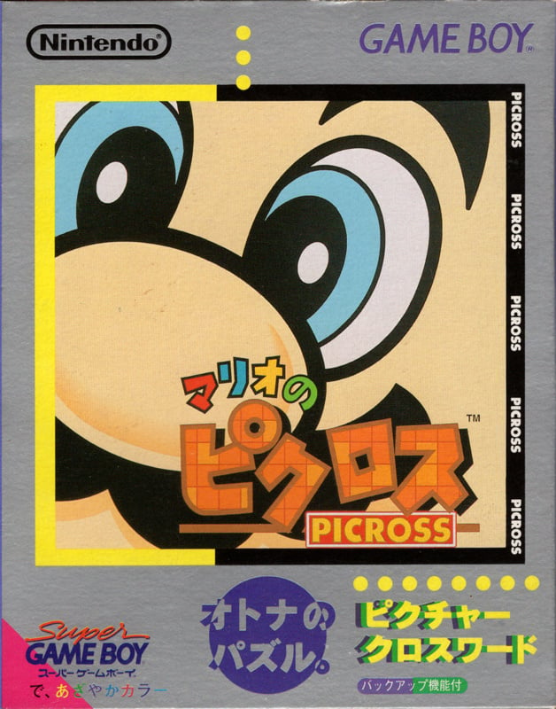
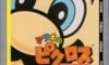
Japan’s design really emphasises the ‘Mario’ of Mario’s Picross. Aside from its grey border, this one is entirely consumed by a giant, zoomed-in image of Mario’s face. Is it a little too zoomed-in? Maybe. But there’s no doubting who the star of the game is.
Thanks for voting! We’ll see you next time for another round of Box Art Brawl.